Flex is a CSS setting that is pretty straightforward but without fully understanding css flex, it can cause some head-scratching slip-ups from time to time. Here is a simple CSS Flex Guide that may hopefully help you out.
What does it do?
Simply put, flex allows you to line up a list of elements nested inside of it. You can choose to line up these nested elements horizontally or vertically. One of the things that always helped me when I first started with flex is that it helps line elements up.
Settings for Flex Containers
There are settings that you can add on both the flex container and its children. Here are some of the flex container settings and how they work.
What CSS Setting Defines a Flex Container? - Display: Flex
So you're probably starting off asking, what css setting defines a flex container? This is the display: flex setting. This essentially sets up flex on the parent container and any children will arrange in a flex way.

Justify Content
So what what does justify content do? This setting controls the alignment of ALL the children elements on the horizontal axis (left & right). Below are the different justify content examples.
Justify Content: Start (default setting)
The justify-content: start setting will line up all of the children elements at the beginning (start) of the flex container.

Justify Content: Center
The justify-content: center css setting will line up all of the children elements at the center of the flex container.

Justify Content: End
Justify-content: end in css will line up all of the children elements at the end of the flex container.

Justify Content: Space-Between
This is where things can get a little bit more tricky with justify content. So what is justify-content: space-between in css? This setting will space out all of the children elements but will leave no spacing on the end elements. In the example below, the 1st and 4th boxes are flush on the end of the flex container's padding instead of having spacing on their furthest ends.

Justify Content: Space-Evenly
The flexbox justify-content: space-between setting will space out all of the elements evenly on both sides of each element. Both sides are important to note here as you will see there is a difference in the next justify setting we talk about. In the image below, you can see that the spacing between each element on each side is even 160px throughout.

Justify Content: Space-Around
So you've seen the space-evenly setting. Now what is justify-content: space-around in css? The easiest way that I've always looked at it is that there is a fixed spacing around each element. The main difference between space-around & space-evenly is that space-around will not have an even amount of space on the end elements' furthest ends. In the image below you will see that the 1st and 4th elements' furthest ends have a lower spacing from the end of the container bounds than the spacing between each element. So in this type of justifying, the end elements will not be spaced the same as the inside elements. For me, it is always best to just know that it will add space between elements but will not space all elements perfectly even as space-evenly would.

Align Items
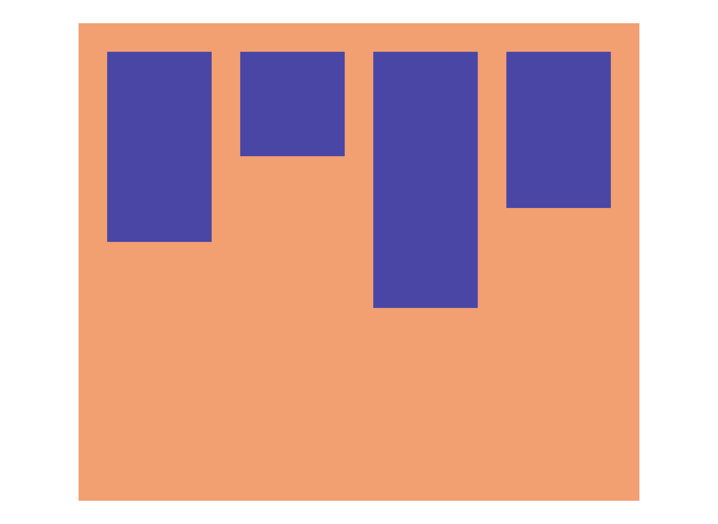
The flex align items setting allows you to align items vertically within the flex container.
Align Items: Start (default setting)
The align-items: start setting (can also be referred to as align-items: flex-start) will line up all of the children elements at the beginning (start) of the cross-axis in the flex container. In the example below in which our flex items are lined up in a row, the items will line up at the start of the vertical axis.
Align Items: Center
The align-items: center flex setting will vertically align the children elements at the of the cross-axis in the flex container. In the example below in which our flex items are lined up in a row, the items will line up at the center of the vertical axis.

Align Items: End
The flex align-items: end css setting will line up all of the children elements at the end of the cross-axis in the flex container. In the example below in which our flex items are lined up in a row, the items will line up at the end of the vertical axis.

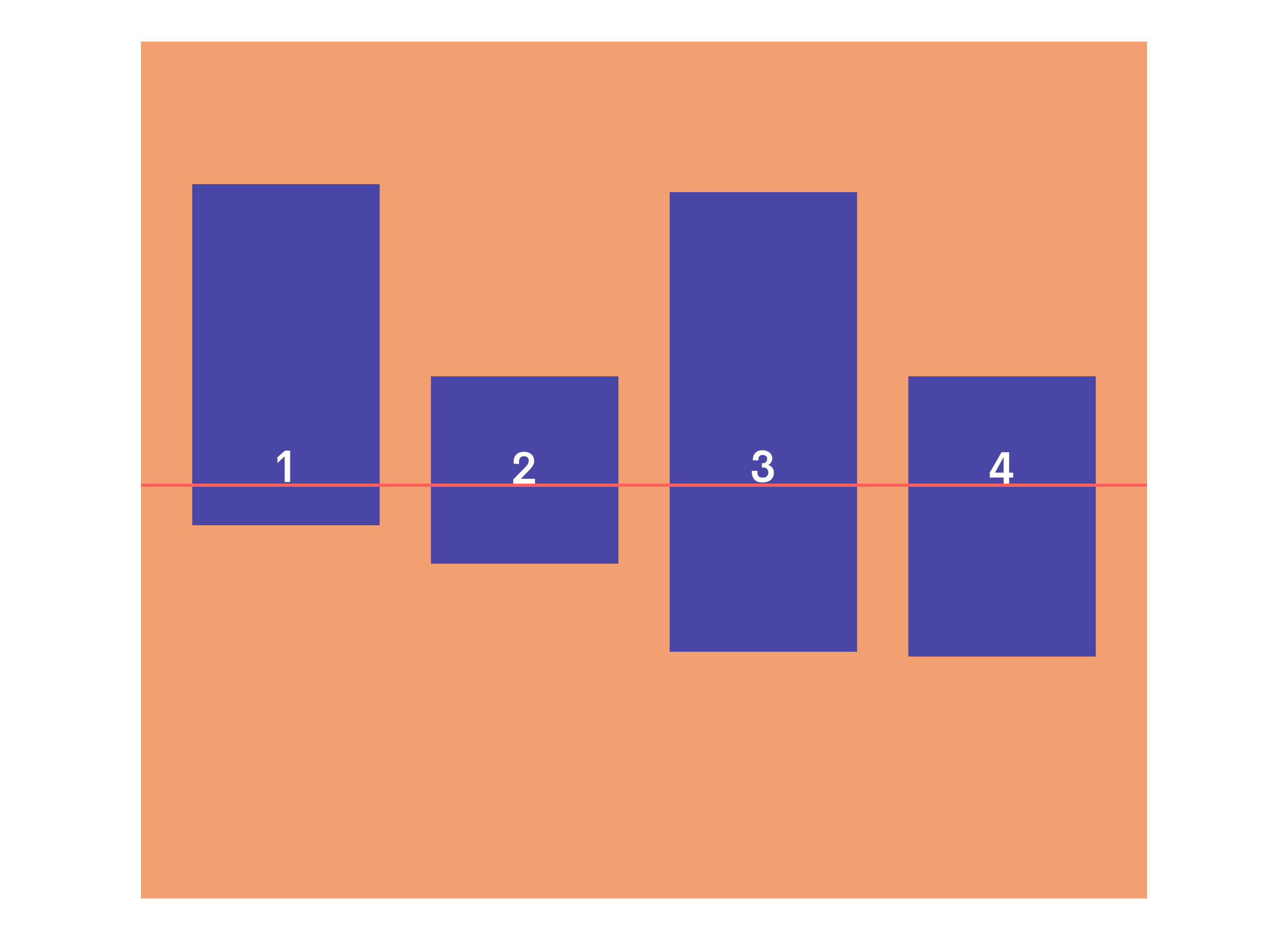
Align Items: Baseline
The flexbox align-items: baseline setting will line up all of the children elements based on the baseline of any text contained within them. Please see the example below for an illustration of this.
Flex Direction
The css flex direction property controls the direction (and general order) that the children will be lined up. The flex direction values consist of row, row-reverse, column, and column-reverse.
Flex Direction: Row (default setting)
The flex-direction: row value in css lines the child elements in a row.

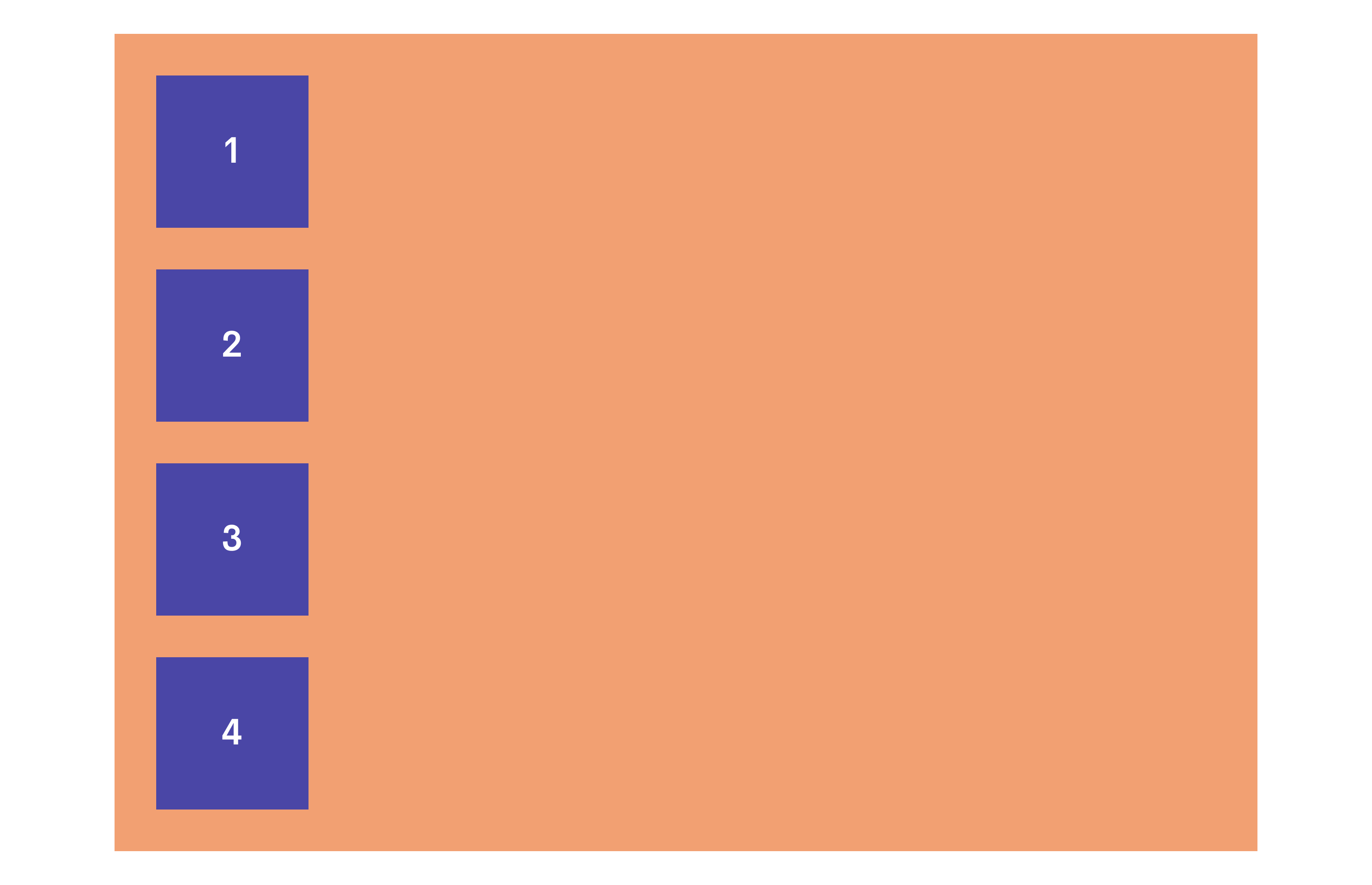
Flex Direction: Column
The flex direction column's setting in css lines the child elements vertically.
Flex Direction: Row-Reverse
The flex direction row reverse flex property is the same as row in the sense that all of the items are lined up horizontally. The difference is that the flex children are organized in reverse order.

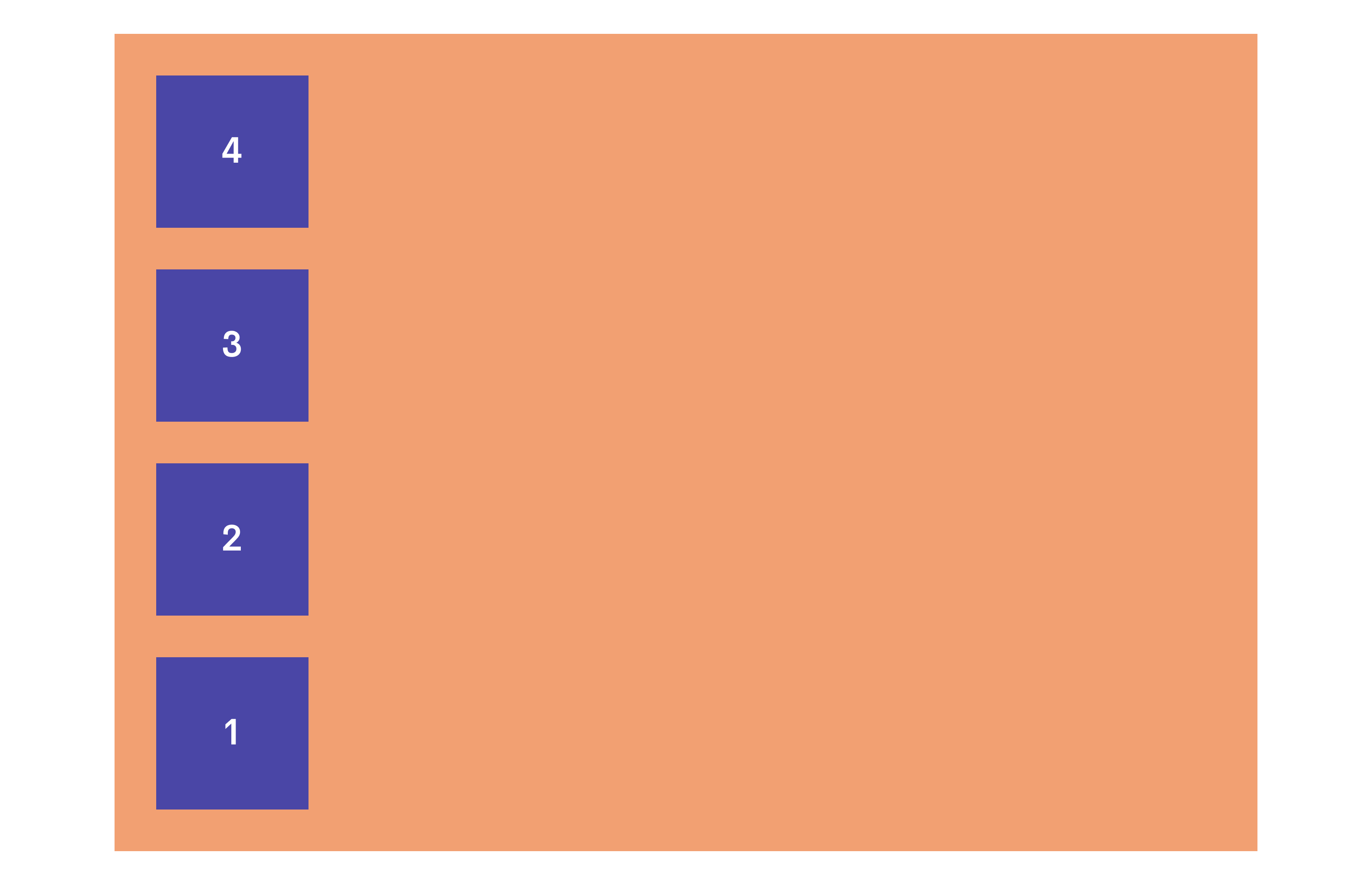
Flex Direction: Column-Reverse
The flex column reverse is the same as column in the sense that all of the items are lined up vertically. The difference is that the flex children are organized in reverse order.
Flex Wrap
Alright on to the flexbox css wrap setting. So what does flex wrap do? This setting controls whether or not the flex children will wrap to the next line when there isn't enough room for them. The flex wrap options consist of no-wrap, wrap, and wrap-reverse.
Flex Wrap: Nowrap (default setting)
The css flex nowrap setting will prevent the flex children from wrapping when the flex container shrinks in size. Unless you have the children widths or flex-basis set to a fixed width, the children elements will continue to shrink as the flex container gets smaller.

Flex Wrap: Wrap
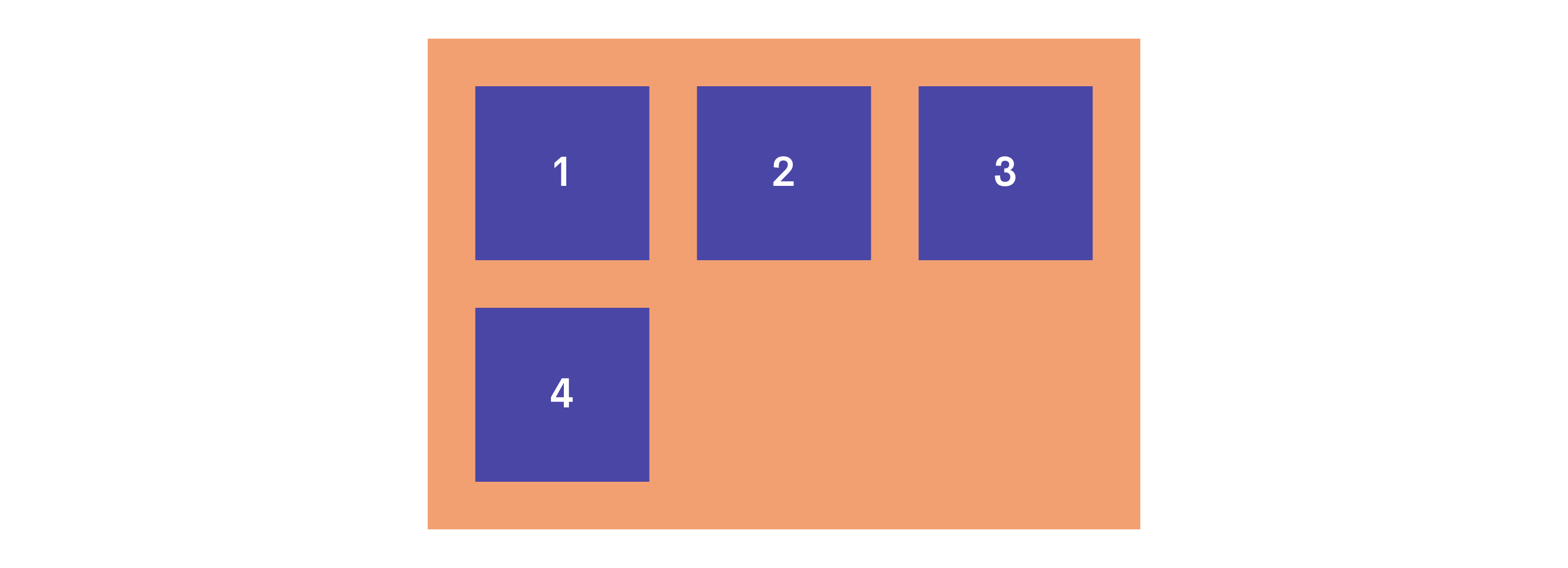
The wrap flexbox option will cause the children to "wrap" over to the next line as the container shrinks in size.
Flex Wrap: Wrap-Reverse
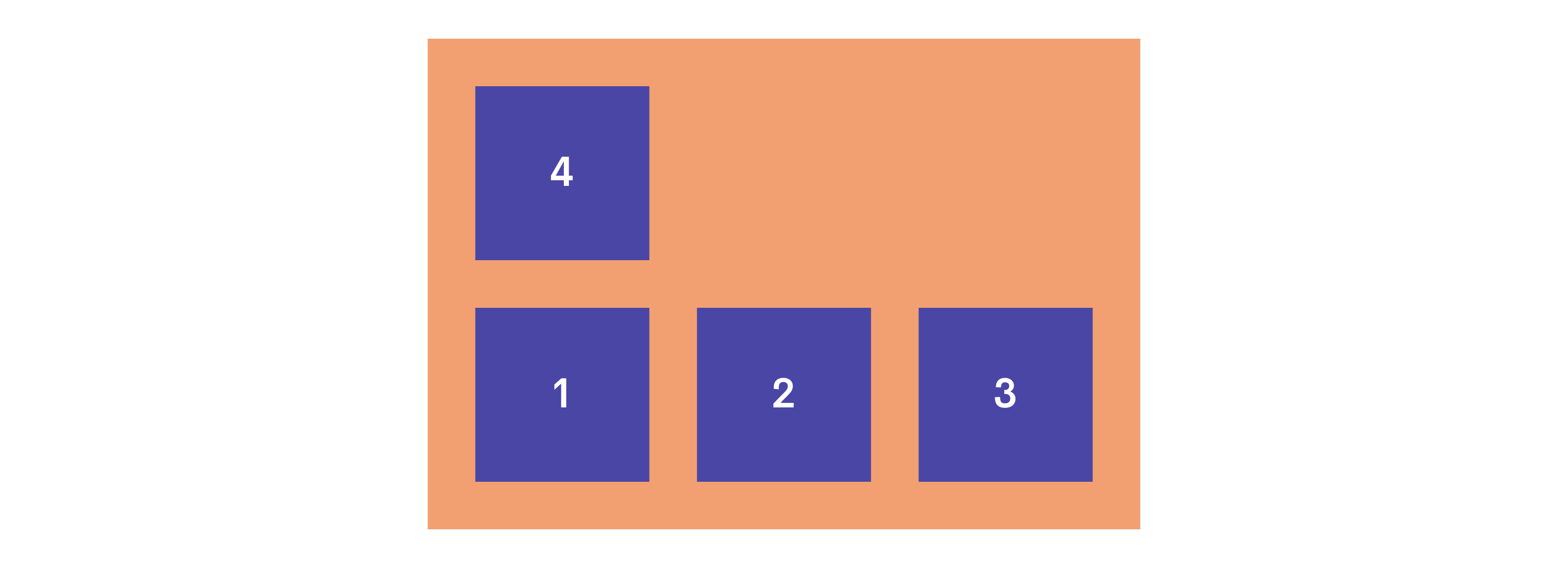
The flex wrap reverse setting will do the same as a wrap but will wrap them above the current list instead of the conventional below direction. See the example below.
Flex Column-Gap & Row-Gap
The flex column-gap and flex row-gap css properties control the spacing or "gap" between each flex item. This can be a good substitute to specify an exact unit (px, em, rem) that you would like each child element to space out by as opposed to adding margins to each child element.
Flex Column-Gap
The flex column gap css property controls the spacing between each "column". This type of gap takes place when flex-direction is set to row. Let's say flex-wrap was set to wrap and the flex child elements ran out of room so the started to wrap and create a new row. Even in this situation, the next rows will also have a spacing between each-other for the value that you set the column-gap to. Also, in the image below, notice that this column-gap spacing only applies to the spacing between each element. This spacing does NOT apply the distance between the outermost elements and the bounds of the flex container.

Flex Row-Gap
This setting controls the flex row spacing between each "row". This type of gap would be important in a couple of situations:
- If you have the flex-direction set to column. This would then cause the children elements to be stacked, therefore now lining them up in rows. That spacing between these rows would be considered the "row gap" which you can then specify an exact unit that you would like these rows to be spaced.
- When you have the flex-direction set to row but set the flex-wrap to wrap. Once the width of the flex-container starts to shrink to the point that the children flex elements are no longer able to fit, they will then wrap to the next row. The row-gap set will also apply to this, as these are now rows that have been created.

Settings for CSS Flex Children
So we just got done covering the flex container settings, here are some of the flex children settings and how they work.
CSS Flex Order Property
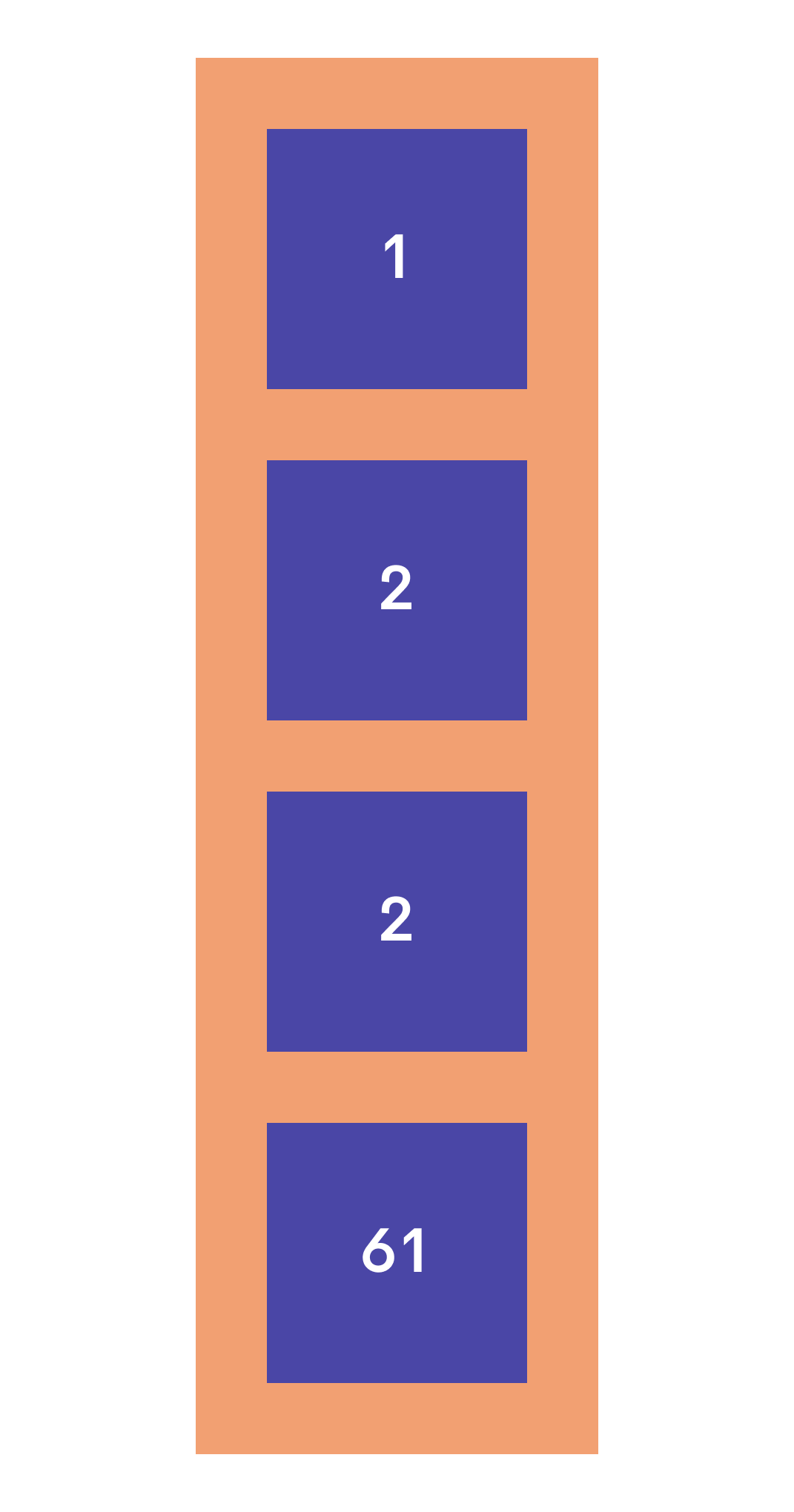
The css flex order property allows you to control a flex child elements order appearance in the flex container. This is specified by a number value. The lower the value, the earlier it will be in the order. The higher the value, the later it will be in the order. If two or more children elements have the same order value, their order between each other will then be determined by how they are originally ordered in the DOM or HTML Markup.


CSS Flex Grow Property
Flex grow controls the flex child element's ability to grow when there is any extra space available. You can specify how much that specific child element will grow with a numerical value. This will then compare to the rest of the child elements, flex-grow value. The higher the value, the more that specific element will be willing to grow. The lower the value, the less it will be willing to grow. If there is no flex-grow value specified, the default value for it will be 0.


CSS Flex Shrink Property
The flex shrink property controls a specific flex child elements ability to shrink compared to the other flex children. This is basically the exact opposite of flex-grow except for the default value for flex-shrink is 1, whereas the default value for flex-grow is 0. In theory, the higher the flex-shrink value, the more it will shrink. Reference the examples below.


Flex Basis Property
The flex basis property controls the flex child's default width before any extra space is taken into account. I kind of think of it as a width for flex children. The width and height values do take precedence over flex-basis though. So if your flex direction is set to "row" for example, and you have a width set, that width will override any flex-basis value that you set for that element.
CSS Align Self Property
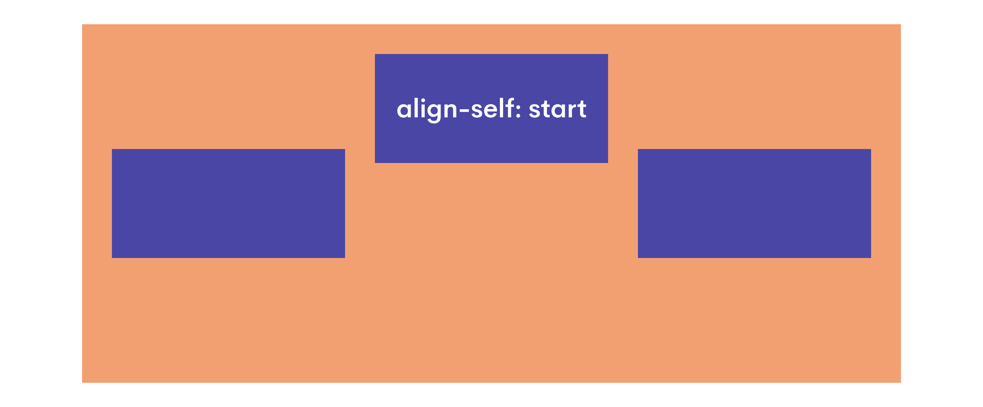
Align self allows you to align a specific flex-child element. This allows you to align a child element differently from the rest of the elements. The different options for css align-self are center, start, end, and stretch.
Here are some other resources that were super helpful to me when first learning CSS Flex 👍
An awesome resource that I am personally a huge fan of is CSS Tricks. They give a bunch of great and free information on everything CSS. Their CSS Flex article goes into more detail about the topic. Feel free to check it out if you are looking for more information on CSS Flex. Here is another link to the good old MDN Web Documents as well.


